-
Hello!
Either you have not registered on this site yet, or you are registered but have not logged in. In either case, you will not be able to use the full functionality of this site until you have registered, and then logged in after your registration has been approved.
Registration is FREE, so please register so you can participate instead of remaining a lurker....
Please be certain that the location field is correctly filled out when you register. All registrations that appear to be bogus will be rejected. Which means that if your location field does NOT match the actual location of your registration IP address, then your registration will be rejected.
Sorry about the strictness of this requirement, but it is necessary to block spammers and scammers at the door as much as possible.
You are using an out of date browser. It may not display this or other websites correctly.
You should upgrade or use an alternative browser.
You should upgrade or use an alternative browser.
Entry #2 for me
- Thread starter Bippy
- Start date
Hakunum-Gutata
New member
very pretty
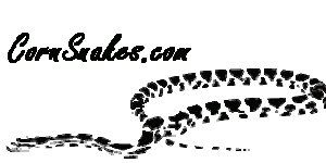
I just love how understated and grounded it is. Yet it is very elegant and in my opinion outstanding. The position and stance of the snake compliments the choice of font perfectly. Anyone who says it stinks has no eye or appreciation for subtle works of art so just don't pay any attention.
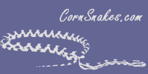
I hope I haven't over done it, but I just really like this one.
Best of luck to you!
I just love how understated and grounded it is. Yet it is very elegant and in my opinion outstanding. The position and stance of the snake compliments the choice of font perfectly. Anyone who says it stinks has no eye or appreciation for subtle works of art so just don't pay any attention.
I hope I haven't over done it, but I just really like this one.
Best of luck to you!
BloodyCats
I like cats.
I like it, too
But some antialiasing on the font might help. I don't know what program you may have for graphics, but I have Paint Shop Pro 7, and it has the option of antialiasing text. Of course, with a transparent background, it presents problems, but you could pick a background color instead of keeping it transparent.
I really do like this one. In fact it's probably my second favorite. I like how it is not overpowering. If you don't have an idea for idea #3, I suggest just playing around with this one-- do everything to it that you can think of even if it seems silly- because it has major possibilities, who know what could happen!!
Bippy
the Prowl
Anti-aliasing...
Yeah, anti-aliasing DOES make a difference. I had it turned off for this image's text due to the background, though. My graphics program (LView) barfs when it tries to do anti-aliasing on a transparent background.
If Rich Z wants, I can make it any color, or add a solid background. It's simple enough that I can change those things easily.
Anyway, thanks for the compliments.
Can I make a minor suggestion?
Invert the image so the head of the snake is facing in towards the page. I studied some graphics design tips a while back, and this was a recommendation that stuck in my mind. Images can lead a viewer's attention, and you do not want to lead a person's attention away from the page you want to be viewed. When you view an image, your eyes will follow a path, so try to capitalize on this. An image to the left of the page should lead the eyes to the right. An image to the right of the page should lead the eyes to the left. Top of the page should lead downwards. An exception is the bottom of the page, in which case the graphic should lead downwards as a lead-in to the next page.
Next time you visit some sites, check out how the images make your eyes move across the screen. And this will also tell you why some pages will get you all confused by all of the pointers making your attention jump every which way on the screen. Unfortunately, many websites are more interested in graphics bells and whistles instead of using them to help their site catch and hold the readers' attention.
Boy, that reminds me! Now that I've gotten rid of all of my milks and kings, I really should change my SerpenCo logo!
very nice indeed. I agree with Rich that some sites actually hurt the eyes to look at. And I won't even get into the ones that have music playing the whole time your on a page! Sometimes simple is better. Anyway once again nice!!
Rich, what is the technical term for that? I know it is called something when you look at a pic and it leads you into the main focus of the picture. Anyway I forgot what that was called, guess it is time to go back to school for me..
Rich, what is the technical term for that? I know it is called something when you look at a pic and it leads you into the main focus of the picture. Anyway I forgot what that was called, guess it is time to go back to school for me..
Heck, I can't remember the term either. But it is really an art form designing a page to move the eyes and put them where you want them. I once read that supposed 'mind readers' would use a technique like that where someone would glance at a page designed in such a way that it would make you think of the number that the 'mind reader' wanted you to think of. 99 times out of 100 it would work and it would appear that he guessed what was in your mind, rather than the truth of the matter being he put that number in your mind to start with.
There are probably all sorts of subliminal cues we are exposed to on a daily basis like that. It may be my imagination, but I have seen a world of difference between people whom constantly watch TV and those that don't. IMHO.
There are probably all sorts of subliminal cues we are exposed to on a daily basis like that. It may be my imagination, but I have seen a world of difference between people whom constantly watch TV and those that don't. IMHO.
Ares
Corn handler
About the term,
Im a graphic designer and in school we called it "eye flow"
not sure if there are other terms for it but thats what we
used. The term means that the layout should lead the viewers
eyes in the flow of a spiral either ending or starting in the middle
of the page.
Hope that helped!
Im a graphic designer and in school we called it "eye flow"
not sure if there are other terms for it but thats what we
used. The term means that the layout should lead the viewers
eyes in the flow of a spiral either ending or starting in the middle
of the page.
Hope that helped!