• Hello!

    Either you have not registered on this site yet, or you are registered but have not logged in. In either case, you will not be able to use the full functionality of this site until you have registered, and then logged in after your registration has been approved.

    Registration is FREE, so please register so you can participate instead of remaining a lurker....

    Please be certain that the location field is correctly filled out when you register. All registrations that appear to be bogus will be rejected. Which means that if your location field does NOT match the actual location of your registration IP address, then your registration will be rejected.

    Sorry about the strictness of this requirement, but it is necessary to block spammers and scammers at the door as much as possible.

Need advice on background colour

Genlisae

New member
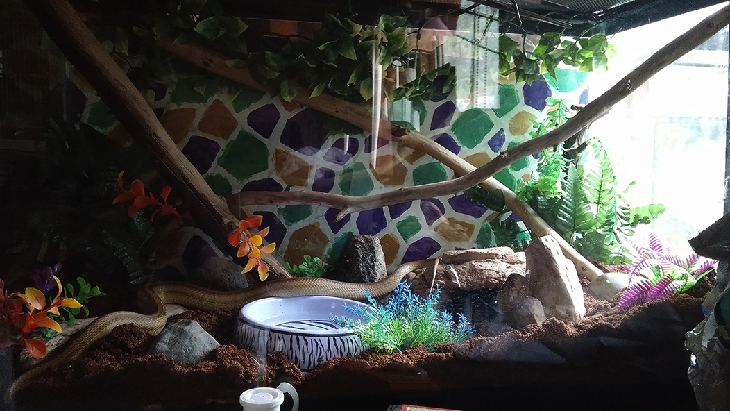
I am in the process of painting a background on MDF. I am aiming for a kind of mosaic tile effect and am just about at the point where I am painting the "grout" lines. My original plan was to go for a silver grout colour, but I thought I would stand it up behind Tequila's tank before I started just to see if the idea was going to work at all.
e2f79d4b27edbc499e890e017403d7e8.jpg


Now I am thinking I might like it more if the grout lines were a dark grey or black, but at the same time I kind of like the light colour for them, I just think the light draws too much attention to the background and the rest of the viv gets lost. Opinions?
 
I think a mid/dark grey would look good. Otherwise, like you said, it pulls too much attention away from the viv. I think black would be too dark though, you'd have a harder time making out the darker colors.
 
What about a dark brown to match the eco-earth? Or I kind of like the light blue tips on that plant right in the middle, what about a light/mid-tone blue grey? Don't you love it when people vote for option other than the multiple choices given?
I agree that white steals the show, though it looks great, and black might be a bit dark.

Can't wait to see the finished product, that looks really cool!!
 
Thank you both for the suggestions. It hadn't occurred to me that a black would be too dark, but I think you are correct.

I hadn't thought of a blue-grey either ... hmm. I may have to experiment with that.
 
Back
Top