evergreencorns
Hissypants
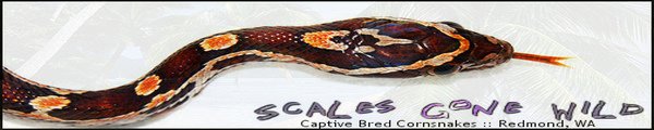
Opinions and ideas/critiques would be greatly appreciated for our advertising banner.
Don't be shy, haha.
Let me know what you think of it.
It's a first go on it, and can be changed. :realhot:
My thinking is that the snakey needs to be more a part of the pic.
But, my fiance likes it more faded.
You? lol
Don't be shy, haha.
Let me know what you think of it.
It's a first go on it, and can be changed. :realhot:
My thinking is that the snakey needs to be more a part of the pic.
But, my fiance likes it more faded.
You? lol
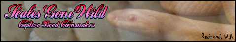
") Or any corns we're selling, really.
Or any corns we're selling, really.