I got into aquascaping (fish tank "landscaping") last year, and I've got to say that this thread has been a fascinating read. Definitely something I'd like to do (
after I've re-scaped my 20G hexagonal trop tank, which keeps getting put off >_>).
A few additional design suggestions that are key in aquascapes, which I think could be applied here:
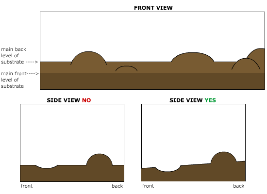
- Don't make the substrate in a level line from front to back: have a gradual slope of all of the substrate from front to back (front slightly lower, back slightly higher, and the hills and valleys on top/carved into). This allows you to see more of the interesting terrain features and creates a sense of depth when looking at the viv from straight on. (Sloping the sides up can also be used to great effect.) Here's a super-quickie visualization of what I mean:
- also, overlapping objects creates depth. Putting a branch in front of or behind a hill, for example, gives the impression that the tank is deeper (front to back or side to side) than it actually is.
- not sure if this was mentioned: the golden rectangle/ratio. 1:1.618. Imagine a line splitting the viv from top to bottom based on that ratio, and put a focal point (something interesting to draw the eye--a plant, a branch, a rock, something) on it. It's one of those wonderful artsy things that makes the human eye happy.
- HAVE ONE MAIN FOCAL POINT! Multiple focal points/points of interest are great, and move the viewer's eye around the viv (a very good thing!), but make sure that there's a single one--on the golden ratio line--that stands out a bit and gives the eye a place to "rest."
- on a similar note, Tracy mentioned 3's being very good, and they certainly are. Try to have 3 focal points in the viv (with one being dominant over the other 2, of course).
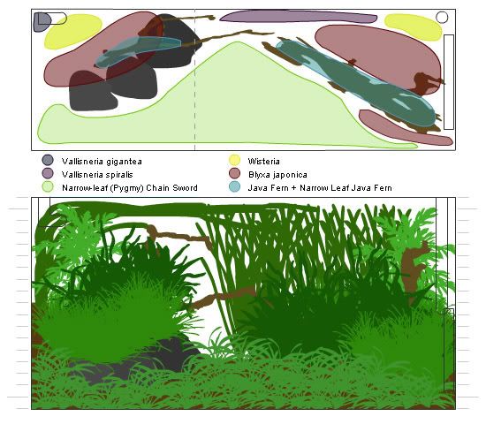
Here are some aquascape layouts I did not too long ago (no photos yet, lol). The first set of images were for a "barely brackish" balloon molly setup (so plants were chosen accordingly, though there were a couple that I was testing). The gray dotted line marks the golden ratio. In this case, I used negative space to create the main focal point; the other focuses are created by groups of blyxa.
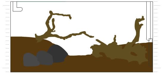
The above image is the "hardscape"--everything but the plants. Here, I put the lowest back level about 4.5" higher than the front, and hills/mounds toward the back corners, creating a clear valley in the front/center of the tank.
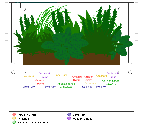
And this was for a mostly bare-bottom goldfish setup, with the plants being in rectangular glass vases along the back wall. Here, there's a big anubias as the main focal point, with a smaller anubias to the right and a stand of vallisneria to the back left as other focuses. No hardscape here, since I was just packing the vases with plants.
I highly recommend checking out some aquascaping resources if you're interested in BASing your viv.
The Planted Tank Forums have a spectacular "Photo Album" section with detailed photographic journals of people's setups, and there are some real pros there. You also might check out the work of Amano Takashi (as in Amano Shrimp and ADA (Aqua Design Amano) Supplies).
I also came across
this site a while back. It's mostly geared towards frog vivs, but I've found it to be a fantastic source of inspiration.
